Landmarks
When you visit a new city, one thing you expect to see are landmarks. Statues, botanical gardens, theaters, skyscrapers, markets. These landmarks help us navigate around unfamiliar areas by being reference points we can see on the horizon or on a map.
As makers of the web, we can also provide landmarks to people. These aren’t arbitrary — there are eight landmarks that are part of the HTML standard:
- Navigation
- Main
- Banner
- Search
- Form
- Content info
- Region
- Complementary
Some of these seem obvious, but some are odd — what on earth does “contentinfo” mean? Let’s walk through what they are, why they are important to provide, and finally how we can really easily use them.
Navigation
Nearly all websites have a primary navigation. It’s often presented as a row of links at the top of the page, or under a hamburger menu.

Stripe’s navigation provides links to the primary pages people want to visit. It’s clear, and follows common practices of showing only a handful of links, and placing the link to sign in up on the far right.
Most visual users would identify this as the primary navigation of the site, and so you should denote it as such in your HTML markup. Here’s what you might write for Stripe’s navigation:
<nav>
  <ul>
    <li><a href="/"> Stripe </a></li>
    <li><a href="/products"> Products </a></li>
    <li><a href="/developers"> Developers </a></li>
    <li><a href="/about"> Company </a></li>
    <li><a href="/pricing"> Pricing </a></li>
    <li><a href="/support"> Support </a></li>
    <li><a href="/login"> Sign in </a></li>
  </ul>
</nav>
Here we use HTML 5’s <nav> element, which automatically has the navigation landmark.
If there’s only one navigation landmark on a page, then people using screen readers can jump straight to it and the links inside. They can visit Stripe’s Support page in a few seconds. It’s like a city subway that connects key landmarks, allowing fast travel between them.
What if you have multiple navigations? Let’s look at GitHub for an example.
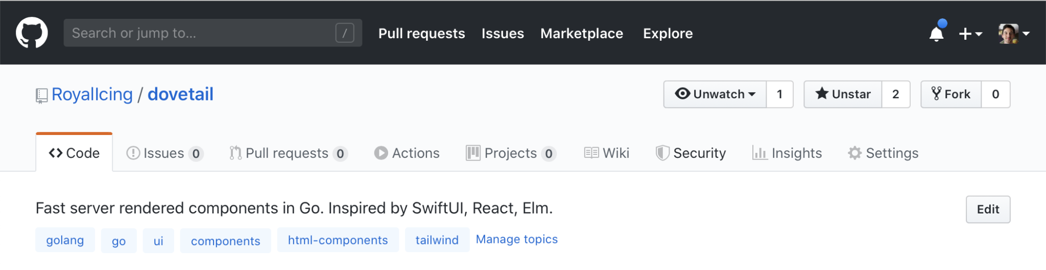
Here we have a black bar offering links to the main parts of the GitHub experience: my pull requests, my issues, the marketplace, notifications, etc.
But I am on the page for a particular repository, and it also has its own navigation: Code, Issues, Pull requests, Actions, etc.
So how do we offer both? And how do users using screen readers know the difference? By attaching labels to each navigation: the top navigation has the label Global, and the repository specific navigation has the label Repository. It’s like a city having multiple sports stadiums: here in Melbourne we have the MCG (used for football and cricket) and the Rod Laver Arena (used for tennis and music). They clearly have different names to identify them by that means people can find them easily and won’t mix them up.
We can add the labels in our HTML like so:
<header>
  <a href="/">GitHub</a>
  <nav aria-label="Global">
    <ul>
      <li><a href="/pulls"> Pull requests </a></li>
      <li><a href="/issues"> Issues </a></li>
      <li><a href="/marketplace"> Marketplace </a></li>
      <li><a href="/explore"> Explore </a></li>
    </ul>
  </nav>
</header>

<main>
  <h1>RoyalIcing / dovetail</h1>
  <nav aria-label="Repository">
    <ul>
      <li><a href="/RoyalIcing/dovetail" aria-current="page"> Code </a></li>
      <li><a href="/RoyalIcing/dovetail/issues"> Issues </a></li>
      <li><a href="/RoyalIcing/dovetail/pulls"> Pull requests </a></li>
      <li><a href="/RoyalIcing/dovetail/actions"> Actions </a></li>
      <li><a href="/RoyalIcing/dovetail/projects"> Projects </a></li>
      <li><a href="/RoyalIcing/dovetail/wiki"> Wiki </a></li>
      <li><a href="/RoyalIcing/dovetail/network/alerts"> Security </a></li>
      <li><a href="/RoyalIcing/dovetail/pulse"> Insights </a></li>
      <li><a href="/RoyalIcing/dovetail/settings"> Settings </a></li>
    </ul>
  </nav>
</main>
Now people using screen readers or similar browser tools can see that there are two navigation to pick from, one named Global and one Repository.
Note also we have an aria-current="page" attribute on the link that represents the page the user is on. This is equivalent to a 🔴 You Are Here mark on a public map.
Main
When watching a show on Netflix, you’ll often be presented with a Skip intro button. This fasts forwards past the intro content that is often the same every time to the part you want to watch: the new episode.
Imagine if that Skip intro button didn’t exist: what would you do? You could watch the minute-long intro every time. Or you could attempt to fast-forward to the spot where the show actually starts. One is tedious and the other is error-prone. It would be a poor user experience.
On the web, our users might find themselves in the same situation. If they use a screen reader, they’ll probably hear all the items in our navigation and header. And then eventually they’ll reach the headline or the part that’s new — the part they are interested in — just like a TV episode. They could fast-forward, but that also would be error-prone. It would be great if we could allow them to skip past the repetitive stuff to the part they are actually interested in.
Enter <main>. Use this to wrap the part of the page where your ‘episode’ actually starts. People using screen readers can then skip past the tedious navigation and other preambles.
Let’s look at that GitHub example again:
<!-- Logo and navigation that’s on every page -->
<header>
  <a href="/">GitHub</a>
  <nav aria-label="Global">
    <ul>
      <li><a href="/pulls"> Pull requests </a></li>
      <li><a href="/issues"> Issues </a></li>
      <li><a href="/marketplace"> Marketplace </a></li>
      <li><a href="/explore"> Explore </a></li>
    </ul>
  </nav>
</header>

<!-- People can skip to here easily -->
<main>
  <h1>RoyalIcing / dovetail</h1>
  <nav aria-label="Repository">
    <ul>
      <li><a href="/RoyalIcing/dovetail" aria-current="page"> Code </a></li>
      <li><a href="/RoyalIcing/dovetail/issues"> Issues </a></li>
      <li><a href="/RoyalIcing/dovetail/pulls"> Pull requests </a></li>
      <li><a href="/RoyalIcing/dovetail/actions"> Actions </a></li>
      <li><a href="/RoyalIcing/dovetail/projects"> Projects </a></li>
      <li><a href="/RoyalIcing/dovetail/wiki"> Wiki </a></li>
      <li><a href="/RoyalIcing/dovetail/network/alerts"> Security </a></li>
      <li><a href="/RoyalIcing/dovetail/pulse"> Insights </a></li>
      <li><a href="/RoyalIcing/dovetail/settings"> Settings </a></li>
    </ul>
  </nav>
</main>
By using <main> we have allowed users to skip the intro.
Banner
We’ve already talked about the top strip on most websites, and these also have a role. Banners hold the primary navigation and also: logo, search field, notifications, profile, or other site-wide shortcuts. The banner often acts as the consistent branding across all pages.

Here’s GitHub’s banner when I’m signed in. The part I’ve highlighted with the yellow outline is the navigation (using <nav>). The entire element uses <header>, which automatically gains the role of banner if it meets the following (via MDN):
Assistive technologies can identify the main header element of a page as the banner if is a descendant of the body element, and not nested within an article, aside, main, nav or section subsection.
So the following <header> has the role of banner:
<body>
  <header> <!-- This gains the banner role -->
    …
  </header>

  <main>
    <h1>Heading</h1>
    …
  </main>
</body>
While this one doesn’t:
<body>
  <main>
    <header> <!-- This does not gain the banner role -->
      <h1>Heading</h1>
    </header>
    …
  </main>
</body>
And you can use multiple <header> elements for things other than banners, if you nest them inside “article, aside, main, nav or section” as MDN mentions.
Because of this, I might recommend that you add the banner role explicitly, as it will make it easier to identify, and also target with CSS with the header[role=banner] selector.
<body>
  <header role="banner"> <!-- Add the role explicitly -->
    …
  </header>

  <main>
    <header> <!-- Because this is nested inside <main>, it won’t gain the banner role -->
      <h1>Heading</h1>
    </header>
    …
  </main>
</body>
Banner’s don’t necessarily have to be a horizontal strip. Twitter has a vertical banner:
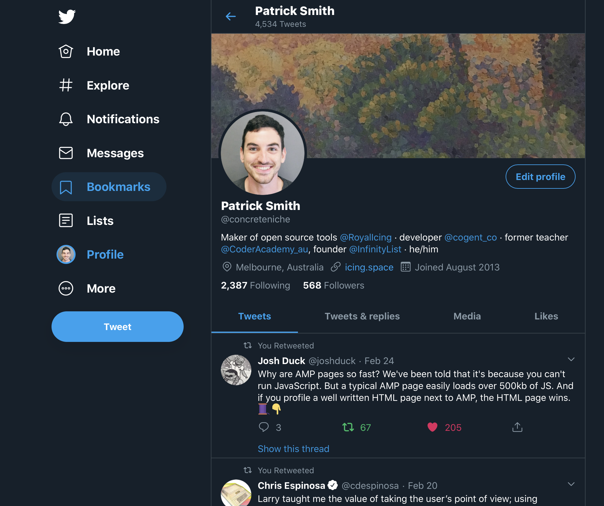
The banner here is the entire left hand column containing Home, Explore, etc. It’s also implemented with a <header role="banner">. The HTML 5 elements are named more for their concept than their visual intention.
Search
Search is one of the things that makes the web great. You have an idea of what you are looking for, you type it in, and in seconds you’ll likely be shown it.
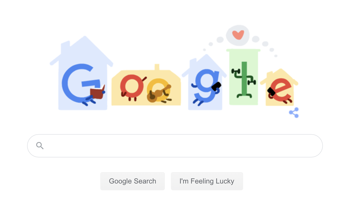
Here’s an excerpt of Google’s famous homepage:
<form class="tsf nj" action="/search" style="overflow:visible" data-submitfalse="q" id="tsf" method="GET" name="f" role="search">
  …
</form>
See that role="search"? This identifies it as the primary search on the page. If someone needs, they can jump straight to the search form and start typing.
Similarly here’s GitHub search form:

<form class="js-site-search-form" role="search" aria-label="Site" data-scope-type="Repository" data-scope-id="203948748" data-scoped-search-url="/RoyalIcing/dovetail/search" data-unscoped-search-url="/search" action="/RoyalIcing/dovetail/search" accept-charset="UTF-8" method="get">
  …
</form>
Again we see a <form> with role="search". If you decide to add a search form to your site, make sure it has the search role.
Form
If you have another form not used for search, say for signing in or creating a new document, then the form role helps out here. The built-in <form> element actually already has the form role implicitly. So what’s left to do?
First, ensure it is labelled so people know what the form is for. That way if there’s multiple forms on a page, they can tell them apart. Also, people can jump straight to the form and start filling it out.
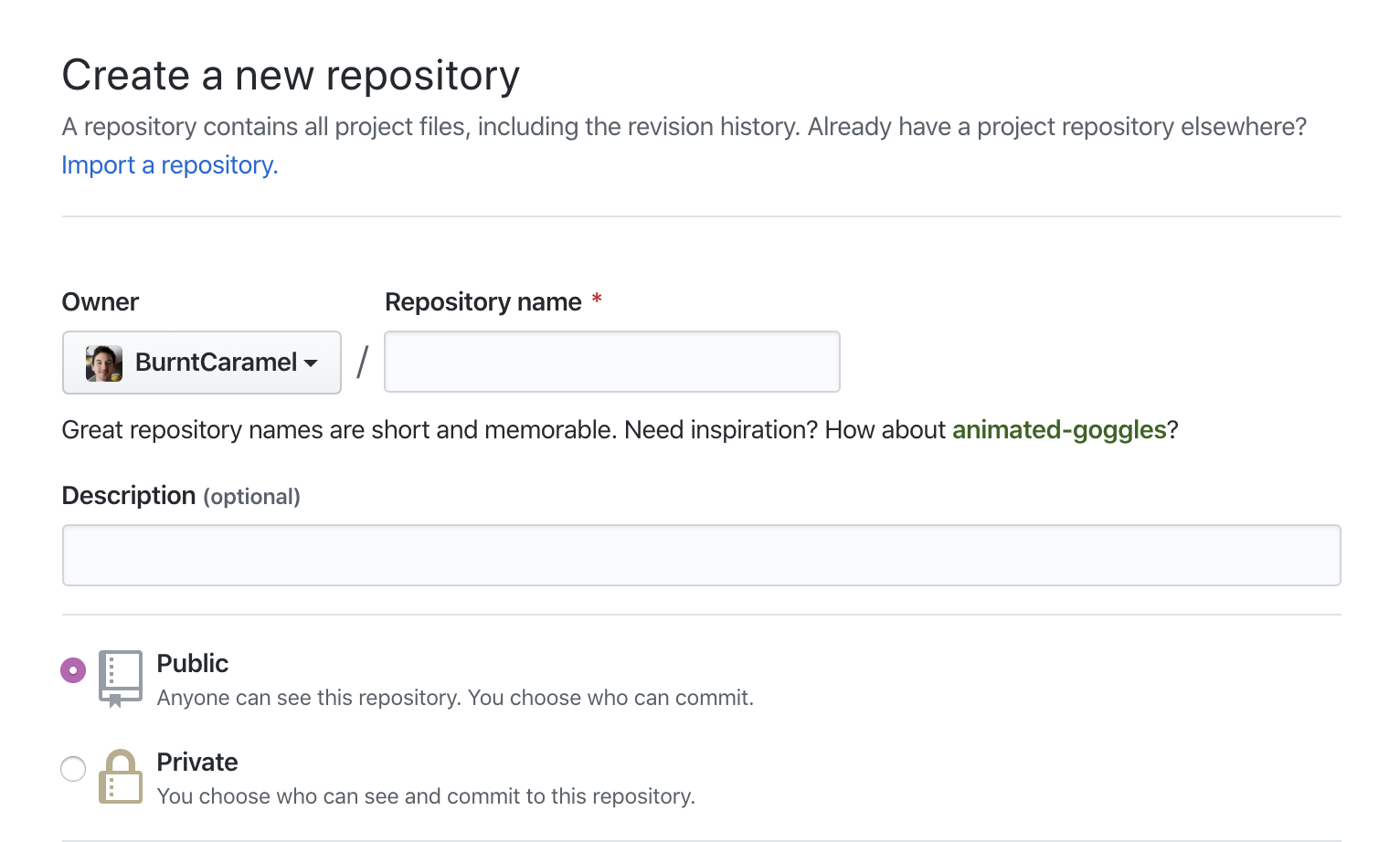
You can add a label by adding an aria-label attribute (note: avoid title):
<form aria-label="Create a new repository">
  <h2>Create a new repository</h2>
  …
<form>
Or by identifying which heading acts as the form’s label:
<form aria-labelledby="new-repo-heading">
  <h2 id="new-repo-heading">Create a new repository</h2>
  …
<form>
Note in both cases we still have a heading — your forms should probably have a label that is readable by all users, not just those using assistive-tech.
Content info
Ok, so the names have been pretty logical so far. And then we come to contentinfo. What on earth does that mean?
Let’s show some examples of where contentinfo has been used in the wild:

It’s a footer! With lots of links. And a copyright.
Akin to the banner role and its automatic provider <header>, we can use <footer>:
<body>
  <main>
    …
    <footer> <!-- Because this is nested inside <main>, it won’t gain the contentinfo role -->
      …
    </footer>
  </main>

  <footer role="contentinfo"> <!-- Add the role explicitly -->
    …
  </footer>
</body>
And also like <header>, it only gains the role if it’s a direct child of <body>. However, it’s recommended that you add role="contentinfo" explicitly to the desired element due to long running issues with Safari and Voice Over.
Complementary
Hierarchy is a core principle of visual design. Some parts of a design will be more important than others, and so it is important that the reader is aware of what they should draw their attention to, and what is less important.
Visual users are aided by size, layout, contrast — and so we need a semantic approach too for non-visual users. This might be a user using a screen-reader. Or it might be a search engine’s web crawler, or someone using the reader view available in Safari and Firefox.
A simple hierarchical relationship is primary content supported by complementary content. Some examples of these are:
- Footnotes to an article
- Links to related content
- Pull quotes
- Comments on a post
Here’s an example article with footnotes, pull quotes, and related links:
<main>
  <h1>Why penguins can’t fly</h1>

  <article>
    <p>Penguins are … </p>
    <p>Their feathers … </p>
    <aside>
      <blockquote>
        <p>
          Penguins swim fast due to air bubbles trapped in their feathers<sup><a href="#footnote-1">1</a></sup>
        </p>
      </blockquote>
    </aside>
    <p>Speeds of … </p>
    <p>They eat … </p>

    <aside>
      <h2>Footnotes</h2>
      <ol>
        <li id="footnote-1">
          <a href="https://www.nationalgeographic.com/magazine/2012/11/emperor-penguins/">National Geographic: Escape Velocity</a>
        <li id="footnote-2">…
        <li id="footnote-3">…
      </ol>
    </aside>
  </article>

  <aside>
    <h2>Related articles</h2>
    <ul>
      <li><a href="…">…</a>
      <li><a href="…">…</a>
      <li><a href="…">…</a>
    </ul>
  </aside>
</main>
Region
We have covered seven landmarks — what’s left? The generic landmark of region. Use it as a last resort — first reach for one of the above landmarks.
Again, HTML 5 helps us out here: we can use <section>. It’s important that you add an aria-label attribute (or aria-labelledby) to name the landmark, so a user knows why it is important and can tell it apart from other landmarks.
At Smashing Magazine, they used a labelled section for their article intros:
<main>
  <article>
    <section aria-label="quick summary">
      In this Smashing TV webinar recording, join Léonie Watson (a blind screen reader user) as she explores the web…
    </section>
    <p>…</p>
    <p>…</p>
    <p>…</p>
  </article>
</main>
This allowed Léonie (who suggested the change) to identify the summary, and skip it if she liked.
Remember, use navigation, banner, contentinfo roles (<nav>, <header>, <footer>) before using region. The HTML spec suggests for using sections:
Examples of sections would be chapters, the various tabbed pages in a tabbed dialog box, or the numbered sections of a thesis. A Web site’s home page could be split into sections for an introduction, news items, and contact information.
<cite> https://html.spec.whatwg.org/dev/sections.html#the-section-element </cite>
Article
We’ve been using <article> in some of the examples previously — is this also a landmark? The answer is technically no, but more or less yes. Bruce Lawson goes into detail on why you should use <article> over <section>:
So a homepage with a list of blog posts would be a
<main>element wrapping a series of<article>elements, one for each blog post. You would use the same structure for a list of videos (think YouTube) with each video being wrapped in an<article>, a list of products (think Amazon) and so on. Any of those<article>s is conceptually syndicatable — each could stand alone on its own dedicated page, in an advert on another page, as an entry in an RSS feed, and so on.<cite> https://www.smashingmagazine.com/2020/01/html5-article-section/ </cite>
An article element also helps browsers such as Apple Watch or reader views know what content to jump to with their stripped-back browsers. And many screen readers will surface them as a place-of-interest.
How to observe other websites
The aptly named Landmarks browser extension lets you view, highlight, and navigate around the landmarks on the current page.

There’s also a free Accessibility Insights extension from Microsoft that provides similar visualization, and also has automated checks for WCAG’s AA.
I encourage you to view landmarks on news sites, social media such as Twitter, web apps such as GitHub, and everything in between. You’ll find that there’s a fair amount of consistency, and some will be better than others. You’ll also have a bar to meet when building your own.
Conclusion
These landmarks apply to all websites: landing pages, documentation, single-page-apps, and everything in between. They ensure all users can orient themselves to quickly become familiar with and navigate around your creation.
They also provide a consistent language that we can design and build around. Share this and other articles (which I’ll link to below) with developers, designers, and managers on your team. Landmarks provide familiarity, which leads to happier users.